Thursday 31 January 2013

Researching Digital Transfers for exhibition.


This week as well as researching artist ,drawing new motifs and shapes and designing my logo and business cards , i'v been researching costings for my final exhibition looking at digital transfer for ceramics ad possible window designs. Whilst research digital transfers i found a website called digitalceramics.com . They have created digital transfers for television shows and the costing for each sheet of A3 transfer paper is appropriate . The ceramics i will be buying from Ikea buying plain white pottery so my colourful flower designs catches peoples eyes. For the ceramics i want the collection to have plates , cups and saucers and maybe a teapot to create a dinning area scene for my exhibition.


IKEA 365+ Coffee cup and saucer IKEA
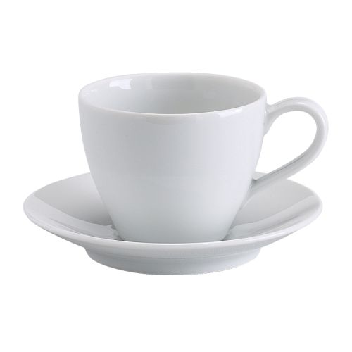
Cups and Saucers from Ikea.
VÄRME Teapot IKEA
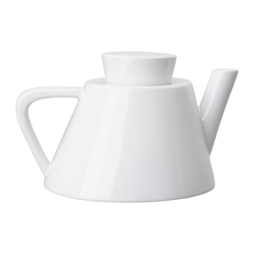
Possibility for a teapot, as it has a 1960's look.
FÄRGRIK Side plate IKEA
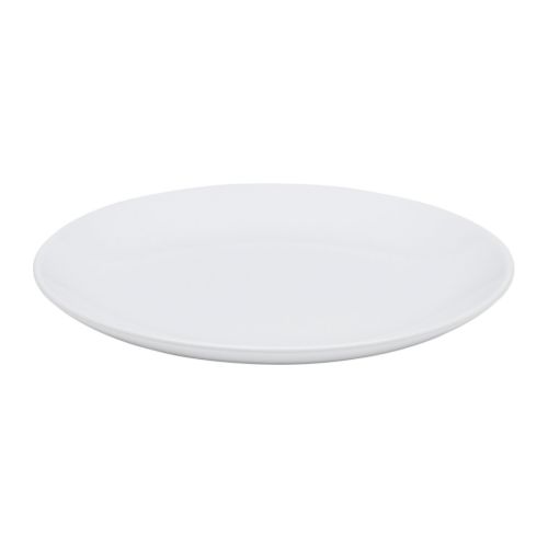
Plain plates from Ikea.

Wednesday 30 January 2013

Jazzaberry Blue Inspiration.

This geometric print reminds me of Optical Art .
Whilst looking through Print & Pattern Blogspot this week , i came across an artist whos work has very simular geometric shapes and patterns to my final project. He uses quite colourful prints to decorate cushions and art prints. Below are a few examples of his work that i find are quite simular to my work.
This piece is quite simular to the geometric shapes im using for my floral patterns. Its an interesting design as its just one design repeated and the design its self has a transparency on it so you can work out how the shape is created.
 
This design is simular to my circle shapes that i did in the previous semester , with a number of vibrant colours to make the work stand out.

Vintage Home ,Southport.

Last weekend , I visited Vintage Home in Southport , to collect some visual research to draw from and to also look at how patterns were created in the past on fabrics. The visit was successful as i came up with ideas of what to draw to then be turned into designs for my final exhibition. Below are a few images taken of the website.
  
1950's Styled Chairs.
Telephone and Ornaments i found interesting in this picture to draw quirky shapes from.
      

Modern style chair from the past. Interesting how one piece of the furniture is a differnt colour to the rest .


Wednesday 23 January 2013

last weeks work

During last week i started collecting visual images of furniture and objects that was popular in the 1960's. Whilst doing this  i came up with an idea of mix matching two objects on a design sheet in geometric sheets. This is an image of one of my A2 sheets with a mixture of images taken from a radio and a television used in the 1960's.

Tuesday 22 January 2013

Lotta Jansdotter

During my research last week finding visual research for creating my business card , i came across a textile design called Lotta Jansdotta. She creates fabrics , papergoods , books and  candles , all with a basic and bold repeat pattern on. I like her work because its quite bold and eye catching even tho its a strict colour palette of two or three colours and a basic repeat. Below are some images of her fabric prints that i find quite interesting.


Thursday 17 January 2013

Rachel Kelly Interactive Wallpapers.

As i am creating wallpapers for my final exhibition with other items for interiors , i started to look at what processes you can use when creating a wallpaper to make it stand out. At the moment for my flower power collection i have been cutting out flowers i have designed to create a 3d wallpaper that stands out and looks different to other classic wallpapers . Whilst researching processes i came across the designer Rachel Kelly who uses stickers and paints to create her wallpaper. With Rachel Kellys wallpapers i like how she overlays flowers in block colours to create an intersting image.


Michael Craig Martin.

Over the christmas vacation i researched Michael Craig Martin , as i paint objects the same way he does by using block colours with a black outline. His work inspires me because i like the way he overlays objects and i like how he uses a number of colours for each piece of work .

Rachel Powels Wallpaper designs.

Deere John Wallpaper


                                   Woodstock Wallpaper

This week whilst researching wallpaper i came across a blog that had some of Rachel Powels work on. I found her prints quite simular to mine from simester one with the reputition of shapes. Her work consist of minimal colours but by using minimal colours it creates a nice effect by all the motifs being repeated.